Facebook rolls out slightly upgraded News feed design on its mobile apps

Facebook, in order make News Feed more conversational and easier to read and navigate, has made a few upgrades over its design. Although not major ones but, there are a few upgrades here and there making things more convenient. The changes have been announced for Android tomorrow however, the new design appeared on iOS few days earlier, including the Facebook app on our iPhone as well.
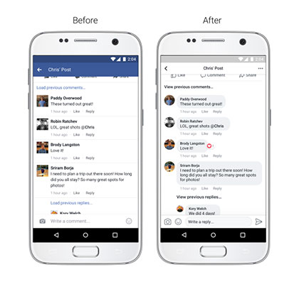
Facebook has updated the comment style and made it easier to see which comments are direct replies to another person. The comments now appear in bubble form instead of the old tabular format.

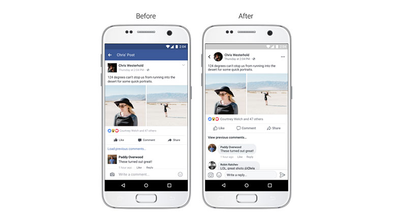
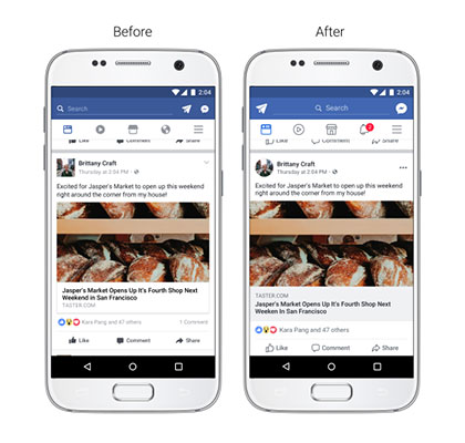
The new look of the news feed includes, increased color contrast so that typography is more legible, larger link previews so everything is easier to read, updated icons and Like, Comment and Share buttons that are larger and easier to tap and circular profile pictures to show who’s posting or commenting.

Apart from this, the new update also makes it a lot easier to navigate through news feeds and post. You can now see whose post you’re commenting on, reacting to, or reading while you’re in the post. You can also see where a link will take you before clicking on it and there is also a more prominent back button which takes you back to the News Feed once you’ve finished reading.
All the new updates will be rolling out in coming weeks, however there is no clue whether the remodelling will be seen in the desktop version of social networking site as well.
We’ll keep you updated with more, stay tuned!


